Sheer Minerals Deodorant
Print ads in newspapers and magazine have always been and continue to be a place where companies try to attract customers to sell their products. With these ads evolving over time to play with the customer’s mind, it would not be a bad idea to look deeper to understand what they are trying to accomplish. The Secret Sheer Minerals Deodorant ad that I have analyzed was published in the Glamour magazine in July, 2010. From my analysis, it is clear that Secret uses appropriate colors, lighting, words and font style effectively to sell their product.
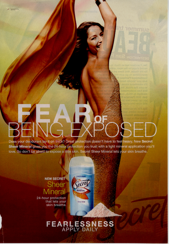
The Sheer Minerals ad published in the recent past targets a group of women between the ages of 16 and 45 years who are interested in using a deodorant or an antiperspirant to smell good, but at the same time are afraid about the negative effects of cosmetics on their skin. Recent research has revealed the negative effects of cosmetic chemical application which has resulted in women being more conscious. So, Secret came up with a new product, that would use this situation to boost their product sales. They claim to have made a product that serves as a deodorant and at the same time enriches the skin with minerals.
Color in this ad is used to focus on what the seller wants us to see. If you notice, the background and her dress are both darker shades of ochre while her skin is bright. This color combination emphasizes on the basic reason for which the product was created, healthy skin. The perfectly tanned and shining skin that this ad shows may not be realistic but it is something that women want to achieve. Since this picture implicitly claims that the Sheer Minerals Deodorant has helped the woman achieve her beautiful skin, it would definitely force the intended readers to try this product. The product is shown in light blue and white color to stand out in the dark colored background. Also the bright powder beside the product emphasizes on “Minerals” of the Sheer Mineral Deodorant. The lighting in the ad also highlights on the reason for making this product. The whole picture starts at a very bright shade on top and darkens towards the bottom. This stresses on the quality of the model’s skin and at the same time, makes the product stand out at the bottom.
The words in this ad help accomplish one of the major challenges in advertising, attracting audience attention. “Fear of Being Exposed”, the main highlight of the ad forces a woman’s eye to read further into the product details. The curiosity to find the relation between her “Fear” and happy expression forces a person to read further details about the product. The company’s name “Secret” makes the product feel more personal by thinking of it as our secret to beautiful skin. Terms such as “24 hour protection” and “lets your skin breathe” helps prove the products superiority over other competitors. It also shows that this deodorant is a healthy way to smell good while not having to think about the risk of cosmetic chemicals. The re-writing of the above phrases again beside the product itself is another way to emphasize the product highlights if the reader choses to skip the small paragraph of explanation. The last words, “Fearlessness Apply Daily” helps one realize that daily use has no harm.
Finally the font style of the text in the ad aids in achieving its ultimate purpose. The first thing that a reader would notice upon opening a page with this ad is to see the word “Fear” written in big and bold font. This immediately holds the reader and forces her to know more about this “Fear”. “Fear of Being Exposed” further increases curiosity on what is being exposed. The word “Exposed” uses its sexual background to sell the rest of the ad to the reader. This helps increase the amount of people who read the ad, thus increasing the number of products sold.
The ethics of today’s society would not help a company that uses this ad with a male figure to sell it to men. Women are always looked at as people who worry a lot about their looks. On the contrary, men are more about attracting women than trying to maintain a healthy skin. Also, the ad would not have been successful if the model portrayed had herself completely covered. It is essential that she exposes a good part of her skin to attract attention towards the advertisement.
The ad uses a lot of visual components to successfully sell the deodorant. It digs very deep and makes use of human curiosity to increase their sample size of readers. It also uses to colors and lighting to appropriately highlight the purpose of the ad. The use apt words put Sheer Minerals over competitors to effectively sell their product.
References
· Secret. (2010, July 21). Sheer minerals Glamour,
Reflection
Unit 4 of English 250 course was a unique experience in which I was introduced to the topic of visual analysis. There were many things that I learnt and applied that made this particular unit very interesting to me. Let introduce you to my work and some of the things that I learnt in the process of completing it.
As a class, we decided that we would be analyzing print ads for the visual analysis unit. I chose and ad from the July, 2010 edition of Glamour. This was the ad for the “Secret Sheer Minerals Deodorant/Antiperspirant” product that was targeted to a group of women between the ages of 16 and 45. Glamour magazine, being a majorly female read magazine would be the perfect place to advertise this product. When I first saw the ad, it was pretty simple as to what they wanted to achieve with this ad. It was definitely eye catching, and the use of words like “Fear” and “Expose” would hold any reader to know more about the product. The advertisement had appropriate colors to reflect the purpose of the ad and a model with “perfect” looking skin in the background. Looking at this, I was sure that this ad would be successful, at least in getting the intended reader to try the product once. This led me to develop my thesis, which states that “Secret uses appropriate colors, lighting, words and font style effectively to sell their product”. I developed support for my thesis by putting myself in the shoes of a female reader, reading this particular ad. The appropriate colors to direct readers from top to bottom of the ad and the lighting to make the background model’s skin shine, the catchy words and the font style, all put together helps make this ad a success. The main problem I ran into while writing my analysis was the ethical dimensions of the ad. Looking at the ad it was pretty difficult for me to come up with a relation to ethics of today’s world, although it was pretty obvious. In the end I did mention it by comparing a men’s deodorant ad to this one and highlighting some key differences.
This topic of visual analysis was completely new to me and this unit has given men a good experience as to what it is. From my analysis, I am sure that I did a decent job, being the first time I have done it. There is still lot of room for improvement and I am sure that this course will lead me through it.
| Visual Analysis |
| Visual Analysis Reflection |
| Visual Analysis Presentation |
| Visual Analysis Instructor Feedback |
